Introduction
The goal of this lab is to use various raster geoprocessing tools to determine the best locations for a sand mine by looking at sand mining suitability and sand mining impact areas within the southern part of Trempealeau county Wisconsin. Model Builder will be used to help explain the process of the raster analysis. Three models will then be used to determine where the best suitable areas are for sand mining in southern Treampealeau county. Then, a fourth model will be used for a scenic horse trail in Trempealeau county called the Eagle View Horse Trail which will be used to see if any highly suitable areas will be within the line of sight of the trail. This trail was chosen because it is one of the main attractions on the Treampealeau county tourism page. The suitability model will take into account the following five criteria:
1. Geology Type
2. Land Cover
3. Distance From Railroads
4. Slope
5. Water Table Depth
The impact model will take into account the following five criteria:
1. Proximity to Streams
2. Erodable Farmland
3. Proximity to Populated Areas
4. Proximity to Schools
5. Proximity to Wildlife Areas
Methods
Model 1: Suitability
First, the suitability model was created. This can be seen below in figure 6.0. All the models in this project move from the top left to the bottom right. Each step is described following the model. The purpose of this model is to find the suitability of areas for sand mines without taking into consideration environmental and community impacts and risks. Most of the reclassifies will break up the raster into three suitability rankings (1 for low, 2 for medium, and 3 for high). A high suitability ranking means that the land is a better location for a sand mine and a lower suitability ranking means that the land is a worse location for a sand mine. Also, whenever the option was given in a tool, the cell size of a raster was set to 30 x 30. This would ensure that the rasters would be able to be aggregated with Raster Calculator.
 |
| Fig 6.0: Suitability Model |
For this, first the study area (southern Trempealeau county) was created by intersecting the Boundary feature class and the Tremealeau county boundary. Next, a couple of the geoprocessing environments were changed based on the study area. The two that were altered with were Processing Extent, and Raster Analysis. Both environments control what the masked area is of an output raster when a tool is ran.
After that, an Euclidean Distance was ran on the rail terminals. That output was then masked to the study area. Lastly, a Reclassify was done to classify the distance from the rail terminals. The values entered for the Reclassify are shown below in figure 6.1. These break values were chosen based of the Jenk's Natural Breaks method. The closer the land / raster pixels were to the rail terminal, the higher the suitability ranking it received. This is because it's advantageous for sand mines to be located near rail terminals for transporting sand.
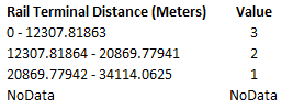 |
| Fig 6.1: Rail Terminal Reclassify Values |
Step 2: Determine the Best Geology Type
First, the geology feature class was converted to raster using the Polygon to Raster tool, then a Reclassify was run so that the Wonewoc and Jordan formations were set to highly suitable and the other geologic formations were set to lowly suitable. The reclassification rankings can be seen below in figure 6.2. The reasons for Wonewoc and Jordan formations being set to highly suitable is because it was told to the author of this post that these formations are highly suitable for sand mining compared to the others.
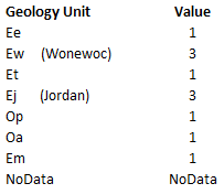 |
| Fig 6.2: Geology Reclassify Values |
Next, the Slope tool was ran on the DEM which was used in the Data Gathering lab to get the slope values of each pixel. Because this had a very peppery output, the focal tool Block Statistics was ran to generalize the output. This takes the average of 9 surrounding pixels and generalizes it into 1. After this generalization, the Reclassify tool was ran to classify the slope values. The suitability values can be seen below in figure 6.3. It was determined that the greater the slope for a location, the lower the suitability ranking it would receive and the lower the slope values would receive a high suitability ranking. This is because it is easier to mine sand in flat terrain than it is hilly terrain. The breaks in the slope values were based off of Jenk's Natural Breaks method.
 |
| Fig 6.3: Slope Reclassify Values |
To do this, a Reclassify was performed on the groundwater depth raster. The values in this raster represent the distance from the ground to the water-table. Information was given to the author that that mining companies prefer to have access to shallower water-tables rather than to deeper ones. Because of this, water-tables which were found to be nearer to the surface received a higher suitability value, and water-tables which were found to the farther from the surface were given a low suitability value. This can be seen below in figure 6.4 in the reclassification values chart.
 |
| Fig 6.4: Groundwater Depth Reclassify Values |
Step 5: Classify the Land Cover Types
In this step, a Reclassify was ran on the land cover raster of Trempeauleau county. The reclassification values can be seen below in figure 6.5. The suitability rankings were decided based on the judgement of the author's interpretation of the descriptions of the land cover classifications which can be found here.
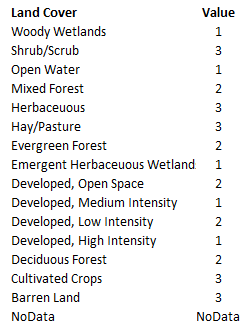 |
| Fig 6.5: Land Cover Reclassify Values |
This was done by running a Reclassify again on the land cover raster. This time though, the land cover types which were thought to be unsuitable for mining were given a value of 0 and the land cover types which were thought to be suitable for mining were given a value of 1. These values can be seen below in figure 6.6. These suitability values were again based upon the judgment of the author to interpret the land cover descriptions found here.
 |
| Fig 6.6: Suitable Land Cover or Not Values |
Step 7: Use Raster Calculator to Aggregate the Rasters
This consisted of doing two raster calculators. The first one just added the rasters from steps 1 through 5 together. Then, the raster created in step 6 was multiplied with this result of the first raster calculator. This result of this second raster calculator (SuitableLoc) outputted the most suitable areas for sand mining based on the rasters and information given without taking any community or environmental risks and impacts into consideration.
Model 2: Impact and Risk
This second models performs similar raster analysis as the first model, but this time, the goal is to identify the areas which have the greatest environmental and community impact to sand mining. Once again, reclassification values are based on a 1 to 3 scale. This time though, the values represent the amount of impact an area / pixel has on sand mining. 1 represents low impact, 2 represents medium impact, and 3 represents a high impact. This environmental and community impact / risk model is displayed below in figure 6.7. The model algorithm is explained below in the following steps. Also, whenever the option was given in a tool, the cell size of a raster was set to 30 x 30. This would ensure that the rasters would be able to be added together with Raster Calculator.
Step 2: Determine the High Risk Farmland
Step 3: Create a Noiseshed to Keep Mines Away From Populated Areas
First, it was decided than the zoning class would be used to determine where the areas of high population are located in the study area. This was done by reading the zoning descriptions and determining which zoning classes have high population. Then, the following zoning classifications where queried out: Residential Public Utilities, Residential - 20 (R-20), Residential - 8 (R-8), Commercial (C), (Incorporated), and Industrial. These were then exported as a new feature class called PopulatedZones to use as the high population areas. Using the zoning feature class has some limitations such as not being able to see exactly where things are, but for the most part, it was good to use this over something like landcover or census data. Zoning classes were a bit more generalized and with just the use a simple query one can find the high population areas.
It was told to the author that sand mines must be located at least 640 meters from a residential area. To create the noiseshed and buffer away from the populated areas, first the Polygon to Raster tool was ran on the PopulatedZones feature class. Then, the Euclidean Distance was ran this new raster. Lastly, this raster was reclassified with the values below in figure 6.10. High risk area were classified as being within 640 meters of a population area. The value 1280 was chosen because it is double 640. This range was given a medium risk value. Lastly, the far away areas (over 1.28 km) were given a low risk value. These values were assigned like this because of the zoning restrictions and because the closer a sand mine is a populated area, the greater community impact it will have on that area.
Step 4: Impact from Schools
 |
| Fig 6.7: Environmental and Community Impact / Risk Model |
Step 1: Take into Account the Proximity of Streams
This was done by first figuring which streams were important enough to be considered for analyzing. It was determined that streams had to classified as at least a 3rd order stream for it to be in this analysis. These streams were then exported as a new feature class by selecting by attributes and then exporting the selected attributes. Then, an Euclidean Distance was ran on this feature class. After that, this distance from these at least 3rd order streams were classified using the Reclassify tool. The Jenk's Natural Breaks Method was used to break up the stream distances into 3 classes. These reclassify values can be seen below in the the classification chart in figure 6.8. The reason why it's a higher risk for sand mines to be near streams is because they often have to pay attention to stream habitat and make sure to not affect it. Therefore, if a sand mine were to be created next to a stream, it would have a higher impact on the land / environment.
 |
| Fig 6.8: Stream Distance Reclassify Values |
For this, the Prime_Farmland attribute table was looked at to see what important attributes could be used to determine good farmland from bad. It was determined that the field which contained values about the erodability of the soil was to be used. This feature class was first turned into a raster with the Polygon to Raster tool. Then, a Reclassify was performed on this field. The values for this can be seen below in figure 6.9. Soil which was classified as highly erodible was given a high risk / impact ranking and not highly erodible land was given a low risk / impact ranking. This is because a sand mine would rather place a mine on stable land rather than land which would erode away as they are mining it. Also, if a mine were created on highly erodable soil, all of the soil would erode away because of the harsh conditions the mine would have on the soil.
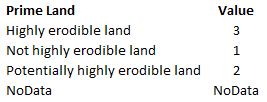 |
| Fig 6.9: Prime Land |
First, it was decided than the zoning class would be used to determine where the areas of high population are located in the study area. This was done by reading the zoning descriptions and determining which zoning classes have high population. Then, the following zoning classifications where queried out: Residential Public Utilities, Residential - 20 (R-20), Residential - 8 (R-8), Commercial (C), (Incorporated), and Industrial. These were then exported as a new feature class called PopulatedZones to use as the high population areas. Using the zoning feature class has some limitations such as not being able to see exactly where things are, but for the most part, it was good to use this over something like landcover or census data. Zoning classes were a bit more generalized and with just the use a simple query one can find the high population areas.
It was told to the author that sand mines must be located at least 640 meters from a residential area. To create the noiseshed and buffer away from the populated areas, first the Polygon to Raster tool was ran on the PopulatedZones feature class. Then, the Euclidean Distance was ran this new raster. Lastly, this raster was reclassified with the values below in figure 6.10. High risk area were classified as being within 640 meters of a population area. The value 1280 was chosen because it is double 640. This range was given a medium risk value. Lastly, the far away areas (over 1.28 km) were given a low risk value. These values were assigned like this because of the zoning restrictions and because the closer a sand mine is a populated area, the greater community impact it will have on that area.
 |
| Fig 6.10: Population Areas Reclassify Values |
Unfortunately, there was no schools feature class in the geodatabase used for this lab. Instead, the parcels feature class was used to identify which parcels were owned by a school district. Then, these parcels were queried and exported as a new feature class called SchoolDistricParcels. Next, a Euclidean Distance was ran on these parcels. This made the feature class into a raster. Lastly, the Reclassify tool was used to classify the distance from the schools. The values used in this can be seen below in figure 6.11. For the break values, the Jenk's Natural Breaks method was used. High impact values are assigned to areas close to schools while low impact values are assigned to areas far away from schools. This is because the closer a mine is to a school, the greater community impact it has on it.
 |
| Fig 6.11: Schools Impact Reclassify Values |
It was chosen that wildlife areas are at risk to sand mining. To determine the risk value for the wildlife areas, first an Euclidean Distance was ran. This made the wildlife areas a raster, and gave distance values in each pixel. Then, the Reclassify tool was used on this Euclidean Distance raster to classify the distance away wildlife areas. The classification values can be seen below in figure 6.12. Once again, the Jenk's Natural Breaks method was used to determine the break values. It was determined that a sand mine would have a high environmental impact if it were located near (within 15.3 km) of a wildlife area. The farther away from the wildlife area, the less of an environmental impact the mine would have on the wildlife area and vice versa.
 |
| Fig 6.12: Wildlife Areas Distance Reclassify Values |
This consisted of using the Raster Calculator tool to create an algebra expression to add all of the rasters together. This created a new raster which had pixel values ranging from 1 to 15. A pixel value of one represents the areas of lowest community and environmental impact a mine would have on that area, and a pixel value of 15 represents the highest community and environmental impact a mine would have on a certain area.
Model 3: Determine the Best Sand Mine Areas
Model 4: Viewshed Analysis
This third model takes the output of the suitability model and environmental and community risk model and combines them to create a raster which shows where the best and worst areas for sand mining are located taking into account suitability and environmental and community impact. This model can be seen below in figure 6.13.
 |
| Fig 6.13: Sand Mine Suitability Ranking Model |
This model subracts the ImpactAreas raster from the SuitableLoc raster using the Raster Calculator tool. To generalize and group the output, the Reclassify tool was then used to rank the suitability of the land for sand mines. For this, the Equal Interval Method was used to classify the pixels values as having a low, medium, or high suitability index. The Jenk's Natural Breaks method was used for the break values. The values used in the reclassification can be seen below in figure 6.14. There are some negative values because of the subtraction used in the algebra expression in the Raster Calculator.
 |
| Fig 6.14: Mine Suitability Reclassify Values |
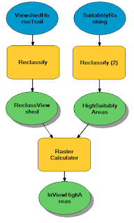 |
| Fig 6.16: Second Part of Viewshed Model |
For this model, a scenic horse trail called the Eagle View Horse Trail was used to see what areas are visible from the horse trail, and what highly suitable sand mining areas are in view of the horse trail. This was done by first running the Viewshed tool with the horse trail and DEM (Meters) of Trempealeau county as the inputs. This outputted a raster which shows which areas are visible from the horse trail. The raster contained two values: Visible and Not Visible. Visible values are the areas which can be seen from the horse trail and Not Visible values are areas which cannot be seen from the horse trail.
Next, to see what highly suitable sand mining areas can be seen from the horse trail, a Reclassify was ran on the viewshed raster. A value of 0 was given to not visible areas, and a value of 1 was given to visible areas. Then, a Reclassify was ran on the SuitabilityRanking to create a raster which only had the highly suitable sand mining area pixel values. Lastly, the Raster Calculator was used to multiply the two rasters together. This raster was given the name InViewHighAreas. The first part of the viewshed model can be seen below in figure 6.15, and the second part of the model can be seen on the right in figure 6.16.
This next map displayed below in figure 6.18 is the result of the expression shown above in figure 6.17 and is the SuitableLoc raster from the suitability model. It shows the most suitable locations for a sand mine without taking into account any community or environmental risk factors. High suitable areas are represented by the dark green hue, medium suitable areas are represented by the middle green hue, and low suitable areas are represented by the lightest green hue. Overall, most of the study area is either classified as being medium or highly suitable for sand mining. The areas classified as being lowly suitable are mainly located in the southwest portion of Trempealeau county are because the land cover in these areas isn't suitable for sand mining. Generally, the highly suitable areas are located in the south and eastern portions of the study area. This influence can mainly be attributed to the distance from rail terminals index and the groundwater depth index.
The next map, shown below in figure 6.20 is a result of the the expression displayed in the series of maps above in figure 6.19. The highest impact / risk areas are shown in the darkest hues of red, the medium impact / risk areas are shown in the middle hue of red, and the the lowest impact / risk areas are shown in the lightest hue of red. This map doesn't contain as much clustering as the suitability map. Most of the study area is located in a medium impact area. If a sand mining company were to use this map to try to find a site for their sand mine, they would want to try to avoid the high impact areas.
Both Models Together
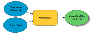 |
| Fig 6.15: First Part of Viewshed Model |
Results / Discussion
Suitability Model
This first map shown below in figure 6.17 includes a series of maps which show the output of all of the reclassifications done in the suitability model. To help visualize the algebra expression used in the Raster Calculator, the expression is shown visually in the series of maps as well. For all the rasters except Suitable Land Cover one, the pixels are broken up into low suitability (1), medium suitability (2), and high suitability (3) values.
This first map shown below in figure 6.17 includes a series of maps which show the output of all of the reclassifications done in the suitability model. To help visualize the algebra expression used in the Raster Calculator, the expression is shown visually in the series of maps as well. For all the rasters except Suitable Land Cover one, the pixels are broken up into low suitability (1), medium suitability (2), and high suitability (3) values.
 |
| Fig 6.17: Suitability Maps and Expression |
 |
| Fig 6.18: Suitability Index for Sand Mining Locations |
Impact / Risk Model
The series of maps shown below in figure 6.19 are the reclassifications of the rasters used in the environmental and community risk model. To help visual the algebra expression used in the Raster Calculator in the second model, the simple arithmetic equation is shown visually. The darker the hue of red, the higher the environmental or community impact a sand mine would have on that area. Values of 1 represent low impact, values of 2 represent medium impact, and values of 3 represent high impact from a mine.
 |
| Fig 6.19: Risk Reclassification Maps and Expressoin |
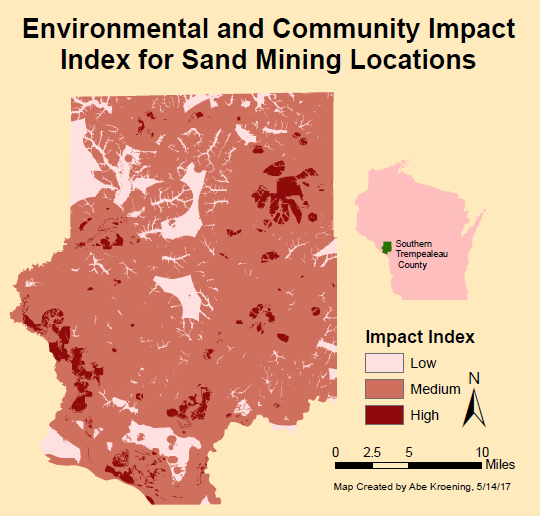 |
| Fig 6.20: Environmental and Community Impact Index Map |
Next, figure 6.21 is the map of the raster calculated from Determine the Best Sand Mine Areas model. This raster is the result of subtracting the impact index raster from the suitability index raster and then reclassifying it. This map shows the best locations for sand mining with minimal environmental and community impact in the darkest purple hues. These areas are located mostly in the south and in the northwest part of the study area. Looking at the two source maps in figures 6.20 and 6.18 this makes sense because most of the highly suitable areas in the suitability map in figure 6.18 are located in the west and southern portions of the study area. Also, there are a couple of main areas present of low impact in these regions in the impact map in figure 6.20. If a sand mining company wanted to take away one thing from this lab, this is the map they would look at. They would be able to identify the prime areas for sand mining and the areas they should avoid.
 |
| Fig 6.21: Best Locations for Sand Mining With Minimal Environmental and Community Impact |
Lastly, a viewshed map was created. This is displayed below in figure 6.22. The two maps reflect the output of the two parts of the viewshed analysis model There are two maps in the figure. The one on the left shows the location of the eagle view horse trail along with the visible high suitable locations for sand mining with minimal environmental and community impact from the horse trail. This is the result of the second part of the model. In general, a good chunk of visible high suitable area can be seen from the trail. However, the trail is fairly small, so only the northwestern part of the study area is affected by this. If a mine were to go up in view of the horse trail, it would most likely be in one of these locations. The map on the right shows all the areas which are visible and not visible from the eagle view horse trail within the study area. The visible areas are shown in green, and the not visible areas are shown in pink. This map could be used to fight back against the creation of a sand mine if one didn't want the scenic view from the horse trail to be affected by a sand mine.
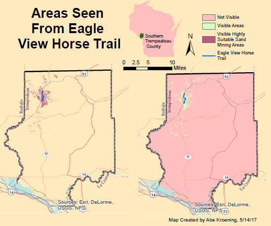 |
| Fig 6.22: Viewshed Map |
Conclusion
Raster analysis is a good way to analyze information which is available in raster and not available in vector format. The process of reclassifying rasters is important as it is a way of standardizing the rasters so they can be used in an algebra expression with the Raster Calculator tool. There are probably many different factors that could be used to expand upon this project. However, the process would be very much the same. If this were to be done for a job, the break values used in the relcassifications would be given much more thought than they were in this lab. Using the Jenk's Natural Breaks method was okay, but there are probably more meaningful break points which could be found by doing a little more research.The results of this lab are broken up so that if one wanted to only look at the influence of certain variables / rasters, they could. A sand mining company could use the maps in this lab to see where the best spots are to create a sand mine. If the scope of this project were to increase in size, the amount of time spent on this project would dramatically increase because the raster datasets would take a long time to process when running some of the raster tools. Therefore, if one wanted to do this for all of west central Wisconsin, one should do so on a county by county basis.
Sources
Trempealeau County Tourism Website
http://www.tremplocounty.com/tchome/misc/tourism.aspxTremealeau County, Geodatabase
http://www.tremplocounty.com/tchome/landrecords/
Multi Resolution Land Characteristics, Landcover
http://www.mrlc.gov/
USGS, DEM
https://nationalmap.gov/index.html
USGS, Land Cover Descriptions
https://www.mrlc.gov/nlcd01_leg.php


